
End to End Application
AutoFix
Project Summary
For AutoFix, our research showed that young drivers felt intimidated and uniformed about car repair. I led the design of an app that prioritized AI-driven assistance and clear tutorials, resulting in a 30% increase in user confidence during testing
Responsibility
-Prototype and testing
-Understanding users needs
-Data analysis
Tools
-Figma
-Figma community
-Procreate
Problem Statement
Many vehicle owners face stressful, costly breakdowns without a reliable source for repair guidance. A centralized platform with price comparisons, shop recommendations, DIY tutorials, and user forums can empower drivers to make informed repair decisions.
Goals
The goal is to give users control and peace of mind by making it easier, clearer, and less stressful to find mechanics, explore DIY repairs, or buy parts online.
Design Process
Designing AutoFix was a pivotal step in my growth, pushing me beyond my comfort zone through extensive user testing, data analysis, and prototyping. I’m proud of the result and excited to share the process.
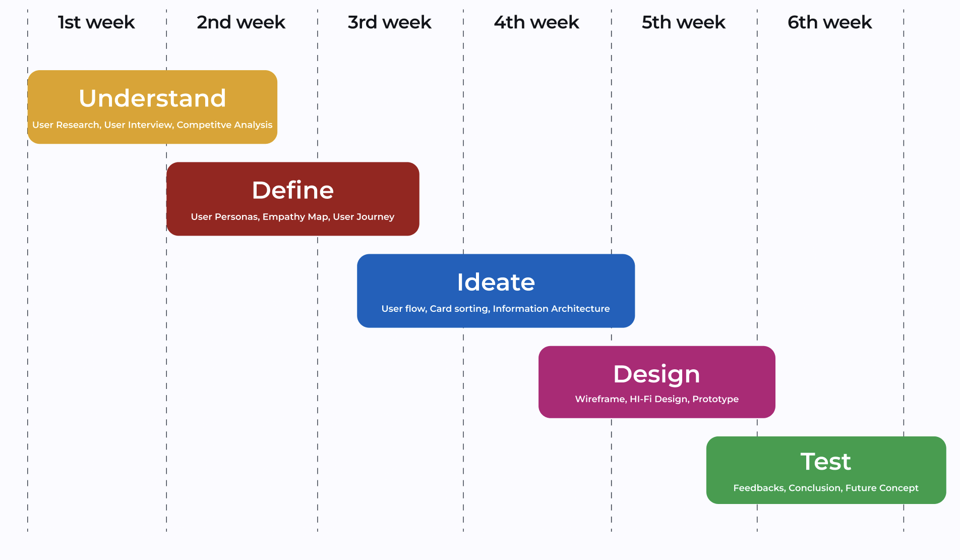
Timeline
Research
Competitive Analysis
This competitive analysis reviewed leading car manufacturers’ apps to identify key features, strengths, and gaps for improvement.

User interview Insight
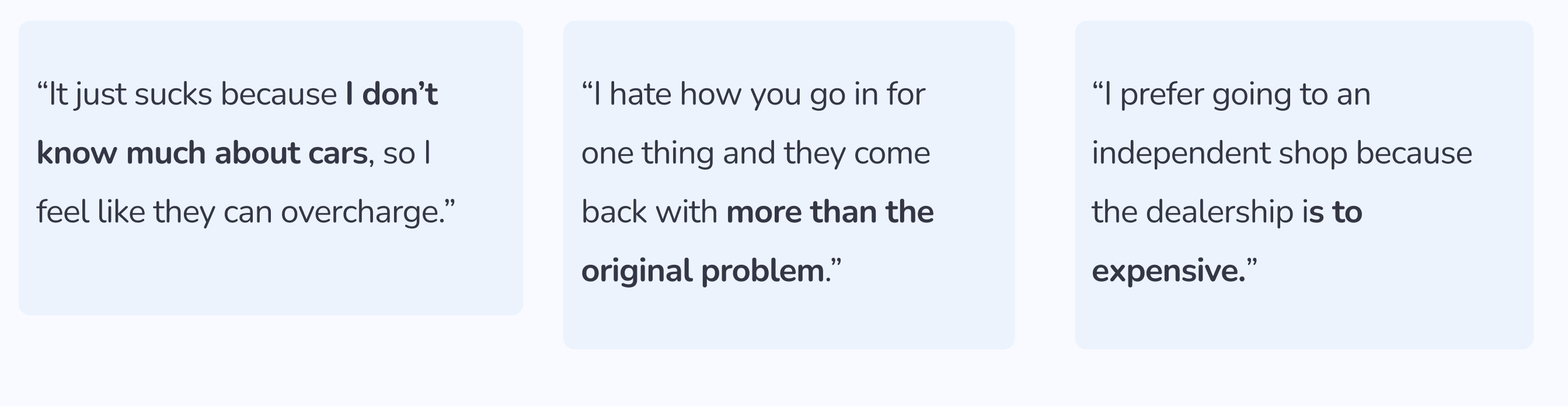
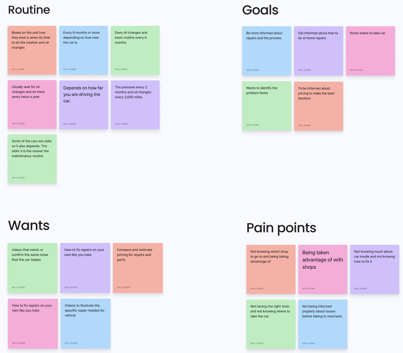
Interviews with drivers aged 20–40 revealed YouTube as the top repair resource, high concern over costs—especially among women—and hesitation to buy parts online due to compatibility worries. Users valued local stores for service, relied on vehicle alerts, and chose repair shops through recommendations or online searches. These insights shaped AutoFix’s focus on trust, transparency, and accessible guidance.
In this Affinity Map I gathered key patterns each participant had in common and used these patterns as a key point to find pain points and more positive aspects as well.

Pain Points
Define
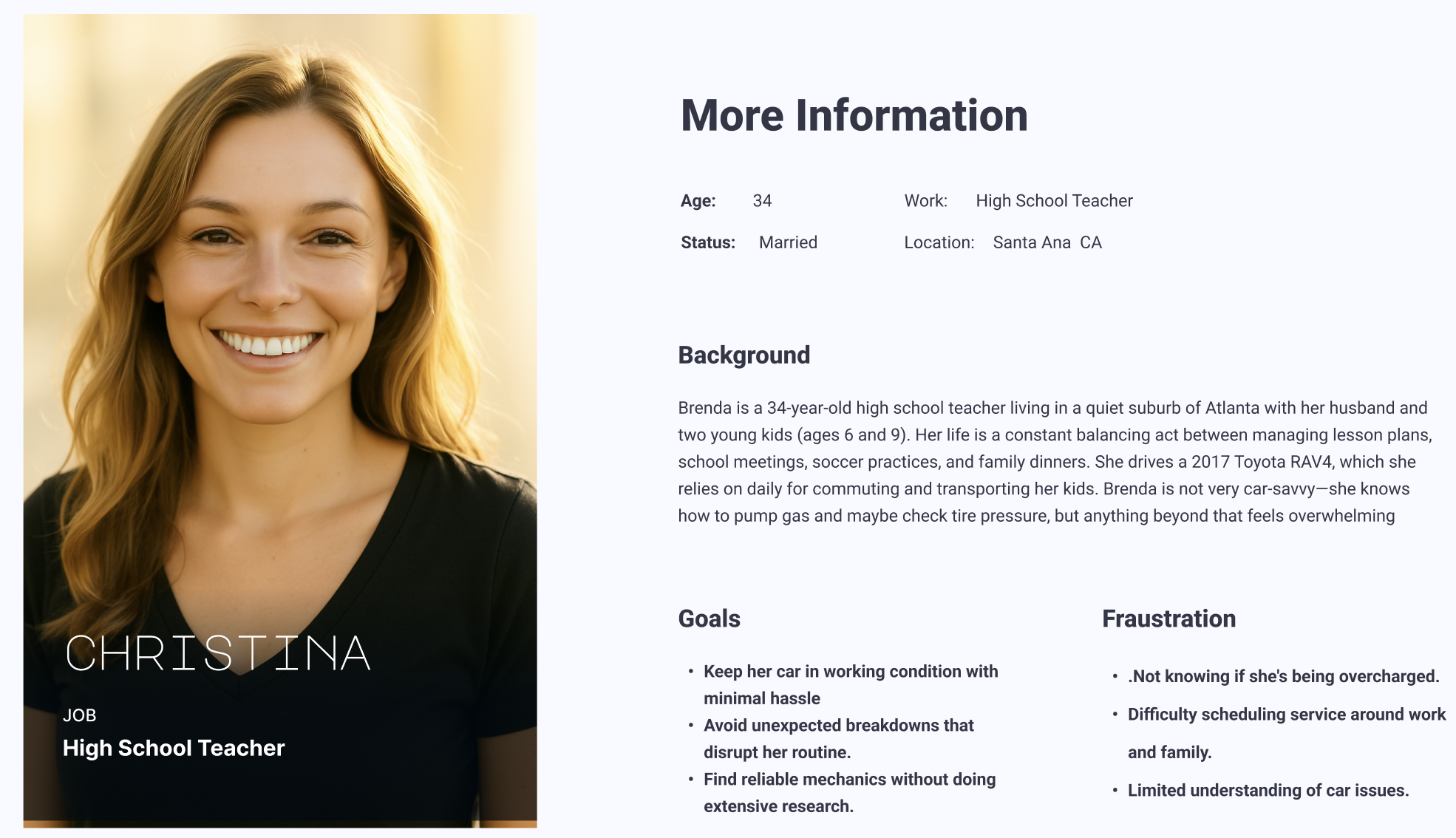
User Persona
For this user flow, key pages were prioritized to ensure that users could successfully complete important tasks. The objective was to make each step intuitive and straightforward, minimizing potential complications.

Featured Set
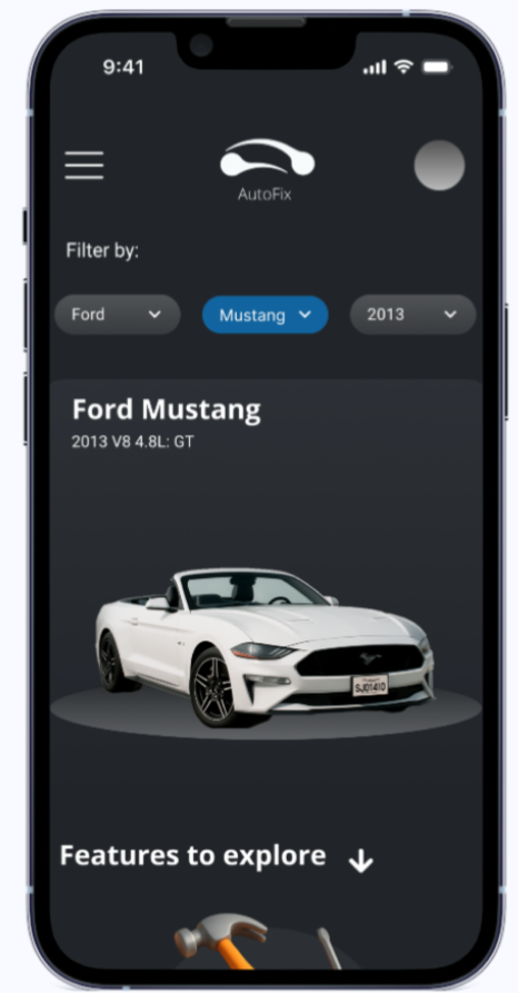
The featured sets were developed to define the key pages before moving into sketching or prototyping. This step allowed us to identify the essential elements for each page, helping us visualize the structure and content more clearly before beginning the design process.

Design
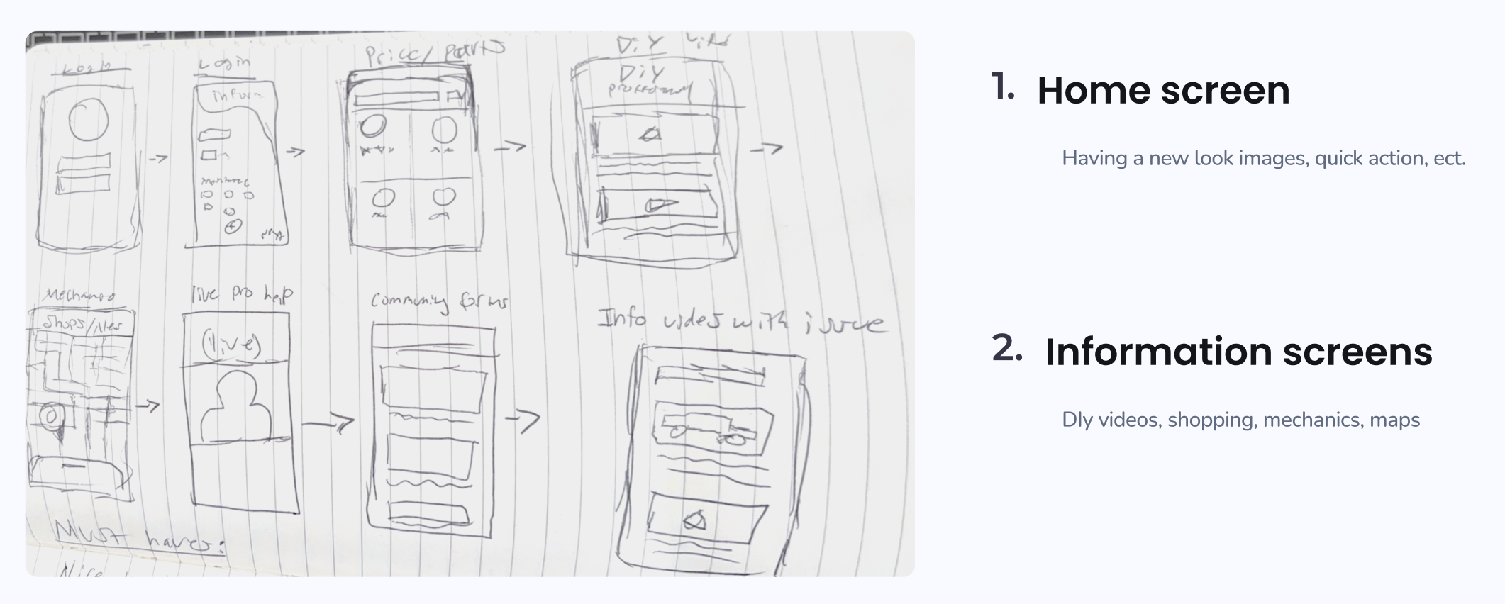
Sketches
Once the key elements for each page were defined, sketching the initial wireframes for prototyping became clearer. Organizing the layouts to arrange these elements was the next step, ensuring both effective user flows and strong visual design.
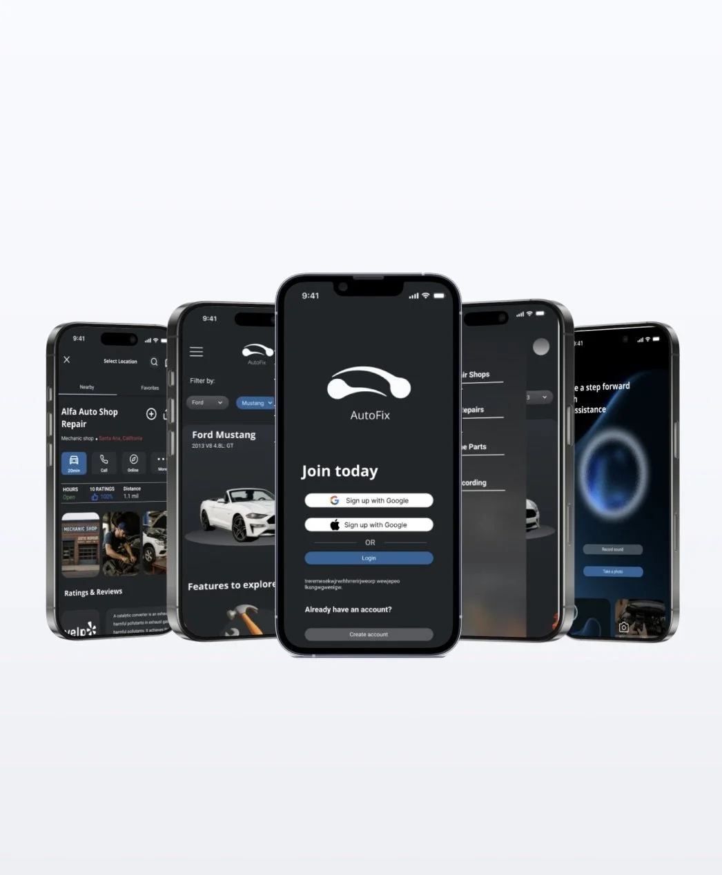
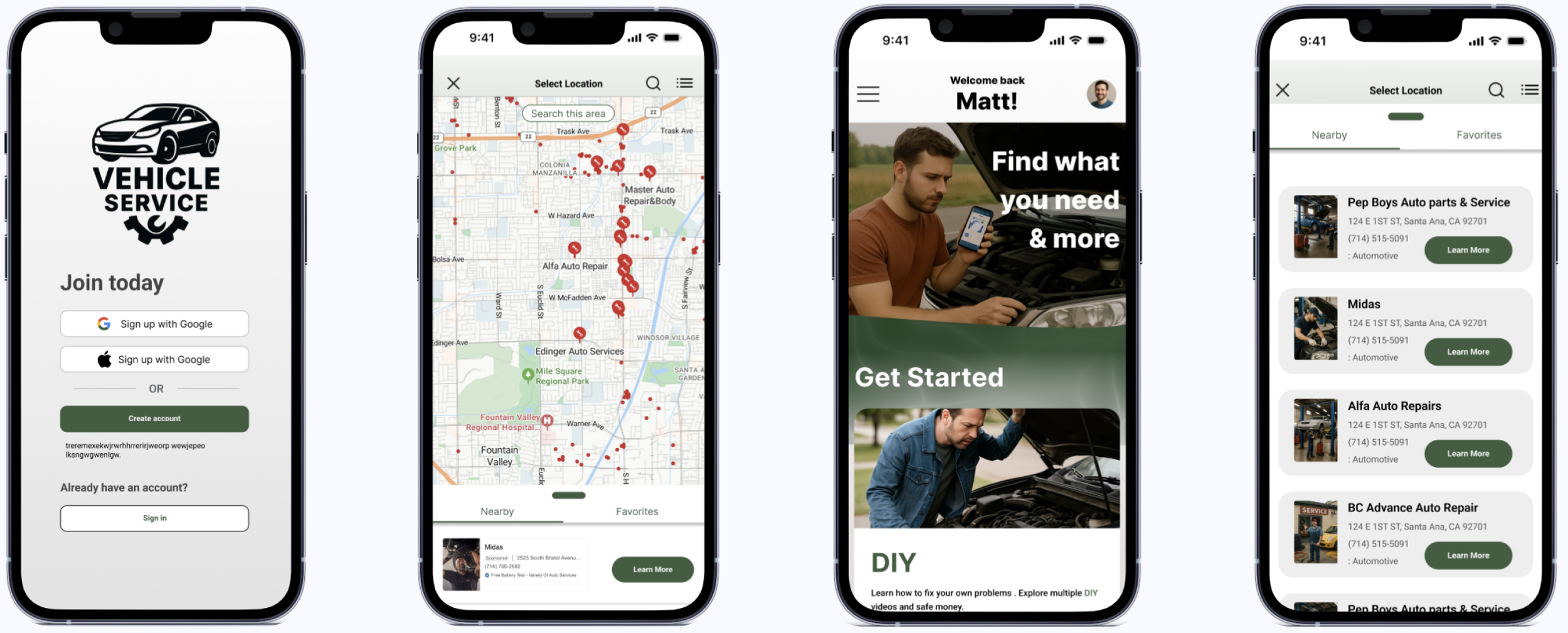
Hi- fidelity Design
At this stage, with a high-fidelity mock up in place, it was time to bring in participants to test the new application. The focus was on observing how users initially interacted with the interface and how seamlessly they could complete key tasks, such as finding mechanic shops, purchasing parts online, and finding a guide for basic maintenance routine.
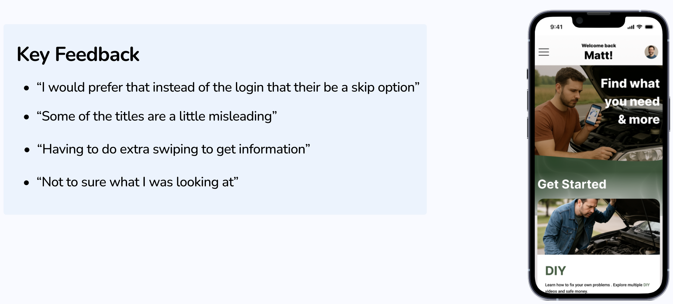
User Testing
After a productive round of user testing, participant feedback had a significant impact on the design changes. The data collected informed a stronger final iteration, resulting in a refined car service application that effectively addressed user needs and provided practical solutions
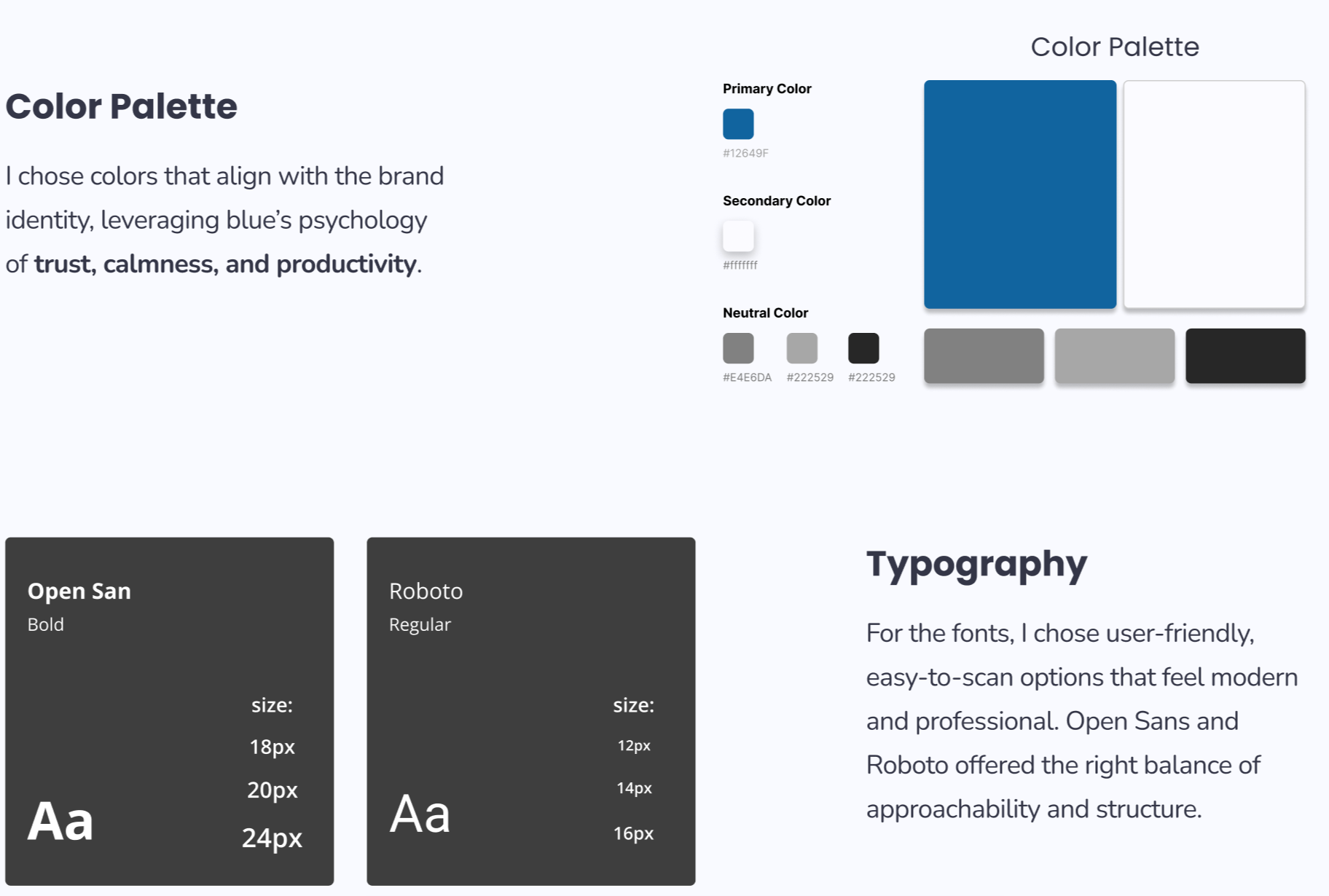
Branding
For the branding, I aimed for a professional yet modern look through my choice of fonts, logo, and color palette.
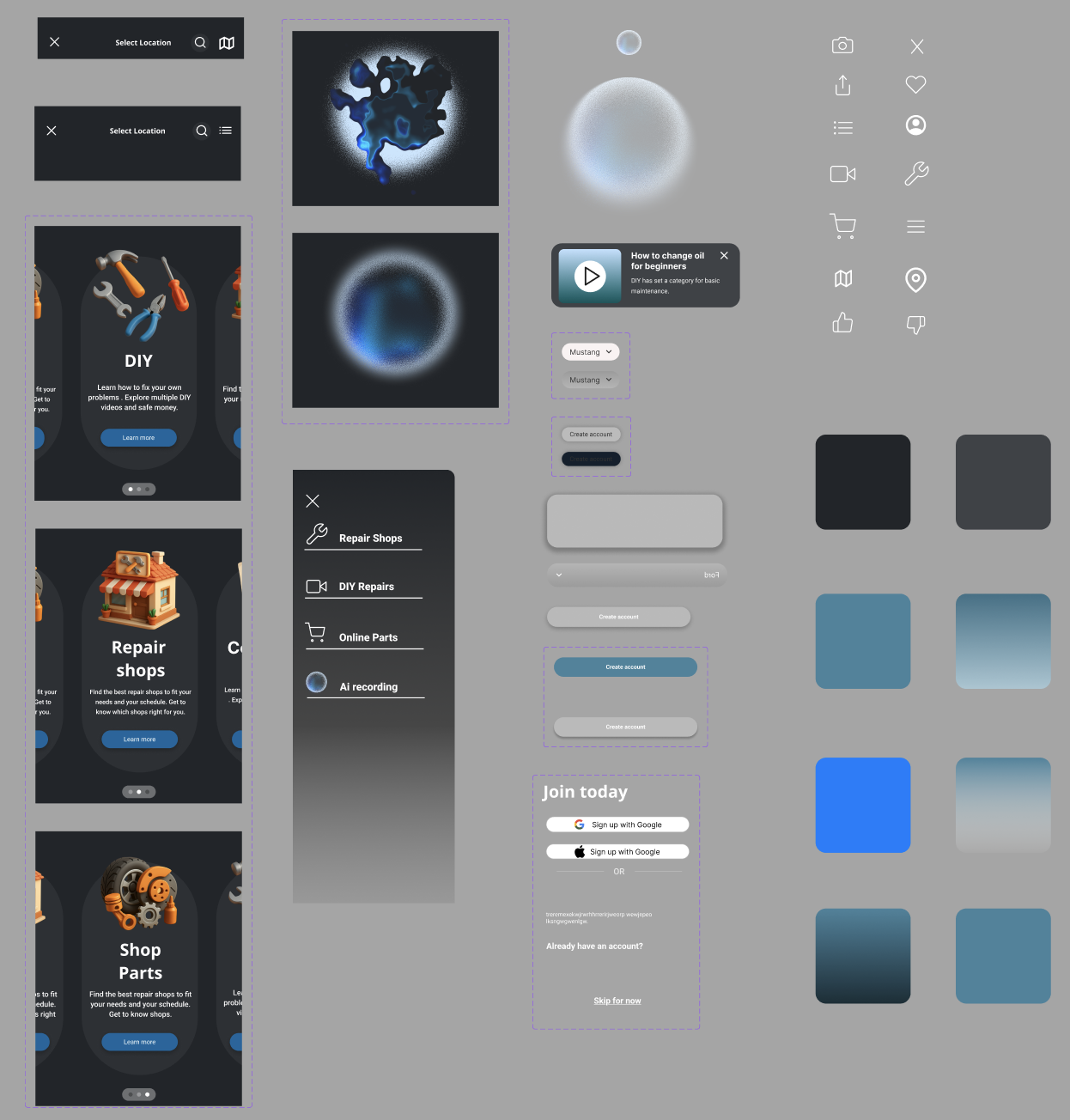
UI Kit
This UI kit showcases key elements I developed during the process, including animations that enhance transitions and support the overall look and feel.
Site Map
I kept the site map simple, highlighting only key pages to minimize confusion when navigating the app

Iterations
Throughout the iteration process, consistent revisions were made to ensure targeted improvements to specific elements. Insights from user testing guided these changes, resulting in a complete redesign that gave the application a modern, sleek appearance.
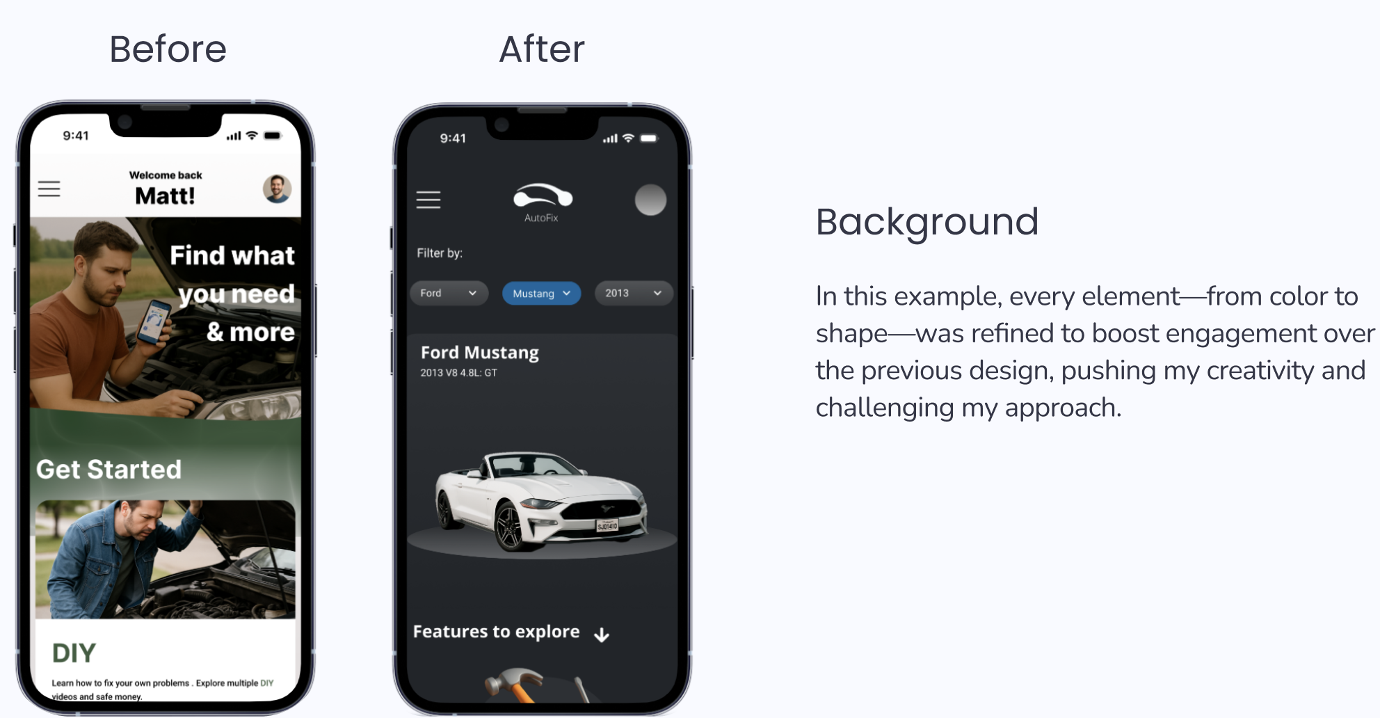

Thanks to the user feedback collected, the final version of the application became more visually refined and user-friendly. Everything from the color palette to the arrangement of elements was clarified and optimized, aligning with the aesthetic of a modern car service app.

Key Takeaways
Key takeaways: This project strengthened my creativity, work ethic, and understanding of UI, showing how elements like color, typography, and shapes can drive impact change. I learned that reinforcing the basics was more valuable for AutoFix than simple rearrangements.
Next Step
Next, I plan to revisit features I’d add with more time, such as AI scanning visuals and animations for a responsive in-app AI chat box.